Two weeks ago we published a post about the brand identity and the huge importance of clear, simple, recognizable logo. And in the comments to that post we’ve been asked to write about some fresh logo trends, so here we are — helping you to be in touch with 2019 and make your company's or personal logo legen...ohh...wait for it...dary. Legendary!

The main trend is a changeable logo design. Now, companies not only ensure their logo adapts well to each of the promotion platforms, but also wonder how a changeable logo design will help them establish a stronger connection with different customer segments. For example, to make a logo attractive to child free people and rooted family men as well. Play with colors and details, forms and feeds. But don't forget that in any variation your logo must be recognizable!
Bright colors and combinations is the next trend of logo design in 2019s. The whole essence of this trend is to give warmth to geometric logos. Combine bold geometric shapes with bright colors. The logo should be minimalistic, but clearly reflect the warp and woof. And colors are a powerful tool, which can tell a lot about a product and a brand in general.

Optical illusion or logos-illusions is the third trend in our today's listing. This innovative approach, which designers turn to in order to stimulate creative thinking, is also one of the leading trends in 2019. Broken and deformed logos are achieved by manipulating distortion and perspective.
![]()

How many ideas can be embodied in a two-dimensional image, and now imagine what kind of field for work and ideas opens in three-dimensional space! The unexpected application of perspectives and the distortion of space, like the one presented above, definitely foreshadows amazing design solutions that await us in 2019.
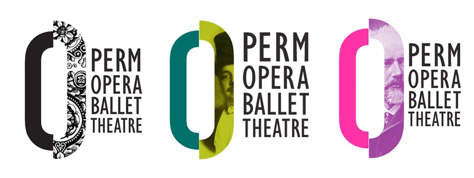
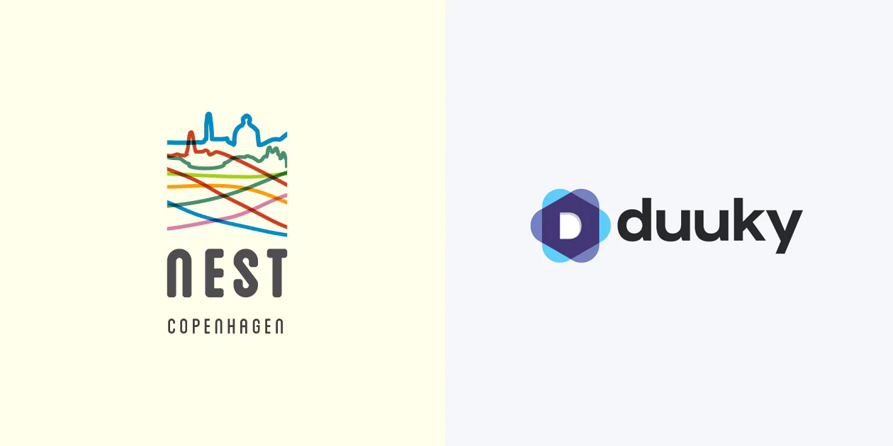
Another popular gee in logo of 2019s is negative space method — excluding something from the design to attract even more attention to this area. Such solutions are created by those who seek to give up almost everything till the point after which the design can disappear completely. The main thing is to focus on the smallest details of each object. This is how you can create something unique.
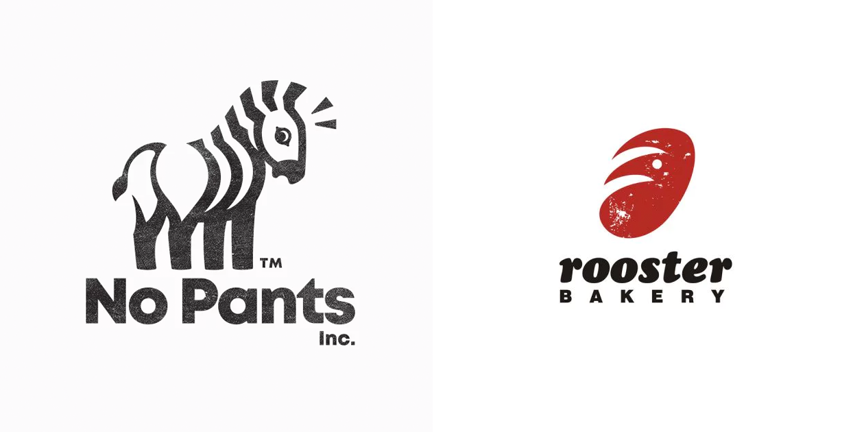

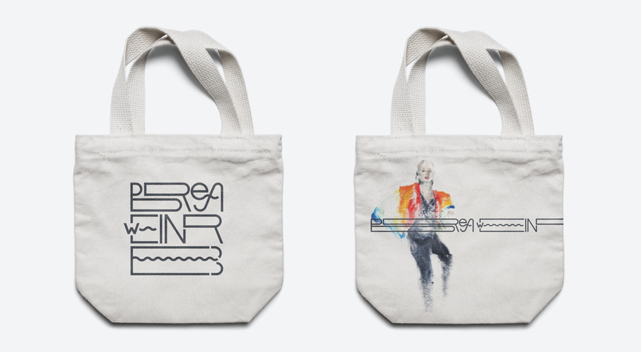
Pictures instead of letters is the trend in the logo design, resulting from the previous one. Such an illustration not only indicates a missing letter, but also carries a message about a brand or product. By the way, such a technique is often used by Google in its doodles.


![]()
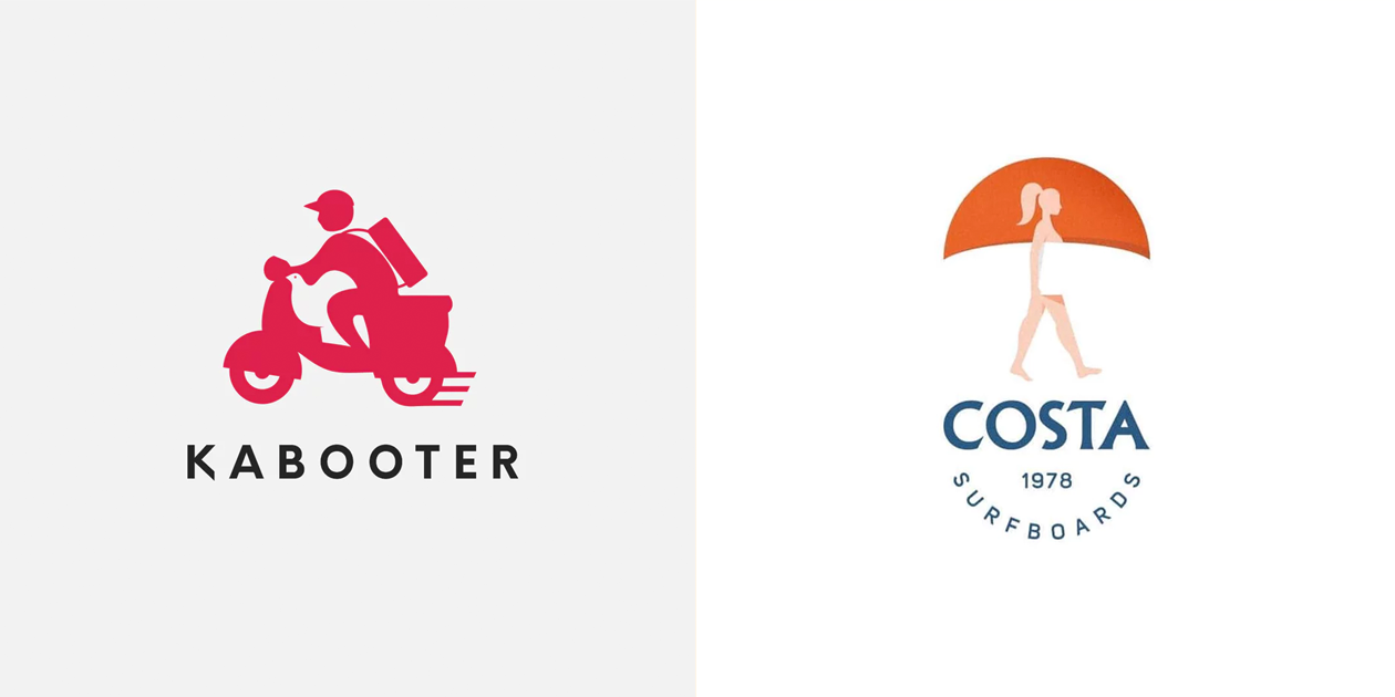
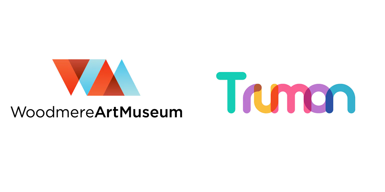
Overlapping elements was firstly introduced into the logos design world nearly 5 years ago by PayPal. And today, in 2019, designers apply this approach with great enthusiasm, actively complementing it with bright colors and bold shapes.
![]()
![]()

Lovely digital illustrator and designer Justina Lei
Creative Leader Ranganath Krishnamani
Creative Works By Andreas Preis
Add comment